Developer Breakdown; the show where video game developers detail the design of their games (whilst @dannyodwyer interviews and dives into the game).
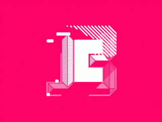
Shifting the focus from the brand, to the content of the show, ended up creating assets which were then used in the final identity. Animated icons were created to illustrate each facet of game development (albeit a small representation of…). These were then used throughout the intro and subsequent logo reveal.
The icons have been created to be purposefully abstract so whilst they tell their own stories, they could really be used across multiple sections of the show. The icons begin as a 2D shape, turning 3D; almost starting with the ‘basics’, then moving into ‘advanced’. As the show was [quite literally in some cases] showing you a video game from a different angle, this is also present in the icons and show’s identity. A simple rotation allows the viewer to see things from a different angle, revealing things they’ve never seen before.
The square or rather, ‘square one’ became the main focal point to the whole brand. The journey of any project requires a starting point which then progresses via working towards milestones. In this case, progress is shown through coding, into visual scripting and finally the end goal (logo reveal), all the while ‘playfully’ navigating through the journey’s landscape. Colour scheme has been taken from a variety of coding screens (where commands etc dictate colour usage).
A bunch of supporting assets have also been created such as transitions, section breaks, lower thirds, PIP frames and tooltip pop-ups. All with the purpose of engaging and enveloping the viewer in these brief, but very fucking cool shows.
For more info on Noclip:
Instagram | @noclipvideo
YouTube | Noclip: NoclipVideo / Noclip CREW: NoclipCrewVideo


